Wednesday, June 12, 2013

Week 11 EOC: Final Evaluation


My time spent throughout this class has been a positive learning experience. I feel that I have gained a much broader perspective on the advertising industry. I have learned many new aspects about advertising including the objectives, elements, careers, and methods in advertising. I also learned about a variety of successful advertising agencies. Since taking this class, I find myself paying closer attention to advertisements that I see. I’ve begun analyzing and critiquing commercials in my head and sometimes even aloud. This class will help me in both my career, and as a consumer.
Learning all about the world of advertising has made me interested in pursuing it as a career, or incorporating it into whatever I end up in.  I enjoyed coming up with my own advertising campaign as a final project. Advertising is a field that allows for creativity and expression of ideas. I typically enjoy brainstorming and coming up with creative ideas; I sure couldn’t complain if I was getting paid for it too. The assignments and content of this course have helped me gain the knowledge I need to grow in my career path, no matter what it may be.
Throughout this course I have turned in all my assignments on time, and gotten them done according to the criteria. I filled my blogs with valuable content, which expressed my understanding of the objectives. I paid attention to the lectures and participated when appropriate. Aside from missing one class period (week 8) I fulfilled my duties as a student in this course. I followed all of the criteria for the final project and am proud of how it turned out. In order to reflect my efforts and work quality, I believe the letter grade I deserve is an A.

Wednesday, June 5, 2013

EOC: Week 10: Advertisement- I Love New York


"IIIIIIII love New York!..." I just can't seem to get this song out of my head. Maybe that's one of the reasons the ad was so successful back when it was made. When New York was having a hard time getting tourists to come visit [and spend money] due to the city's bad rep, New York needed a good idea to draw in more visitors.

An advertising campaign came up with a simple phrase that made a huge impact. "I love New York". The commercial incorporated different characters from all of the different Broadway plays and musicals. "I love New York" was the jingle and only lyric of the entire song. The different performers sang the same phrase and the same tune in each separate scene. The idea was to express how great Broadway is and that "there is only one Broadway." True. There is only one Broadway, and it's magnificent. New York just needed to prove it.

Being a theater fan, and previous performer myself, I really enjoy this ad. I get excited when I see characters from a few of my favorite musicals show up on the screen; including a few plays I have performed in (not on Broadway of course). The song is catchy and, because it’s only one lyric, it is easy to remember. I have to admit I do “love New York”, although I didn’t need a commercial to tell me. Either way, the commercial was a hit, and created a whole new outlook for outsiders of New York city. Today we still see souvenirs, t-shirts, key chains, and more with the famous phrase “I Love New York”. It’s exciting to know just where that phrase started.

Wednesday, May 29, 2013

EOC Week Nine: Creative Content


For my creative content I am planning on creating an advertisement for a magazine, catalogue, etc. The advertisement will be a a photograph featuring a man, reading a newspaper. Only his hand and maybe the top of his head will be showing. Everything in the advertisement will be black and white - the print on the newspaper, ad itself, and most importantly, the small plate of cookies and milk that the man "has been" eating. The cookies will be the one and only... Oreos.


Keeping a black and white theme goes along with the slogan and entire concept for the ad. "Black and white will always be classic." Oreos have been around for a century; they are cookies that can be considered classic. As Americans we love our classic brands. We all have our go-to brands, the ones we are emotionally faithful to. Oreos may be milks favorite cookie, but they are also one of America's favorite cookies.


In my advertisement I want to emphasize the sophistication, and classic concept of the Oreo brand. Black and white is a pair of colors that we also categorize as classic; Oreos are one of the only cookies we think of when we think of a black and white cookie. The whole advertisement should flow nicely and color coordinate.

Final Project: Analysis of Project in the Real World

Creating this advertising campaign has been a helpful experience to get a taste of what it might take to create a real campaign someday. It required a large amount time and research that needed put in to have an understanding of competitors, target market, and originality. "In an overcrowded, competitive marketplace, relevant and engaging branding can ensure efficacy for a quality product, service, group, individual, or commodity. Not only does branding identify and distinguish, it builds equity (the value of the brand or group)." (Advertising by Design. John Wiley & Sons P&T. Page 49) It was fun being creative and coming up with a slogan and idea to advertise my product choice.
I chose Oreo because it is a popular cookie - Americas favorite cookie (something I discovered throughout my research)  as a matter of fact. Oreo has many fans and always has creative and effective advertising. Something unique about the brand that gives me a good vibe about them is their Twitter account. Whoever runs the Oreo Twitter account makes an effort to reply to many of the tweets directed at them. I always see Oreo responding to fans and tweets they have been tagged in. I've had a personal experience on two separate occasions where Oreo has replied to Twitter posts I have mentioned them in.


"People do not usually say, 'I don't want to be more creative.' In any discipline, from science to music, creativity is valuable."(Landa. Advertising by Design. John Wiley & Sons P&T. Page 32) Coming up with the creative content for an advertisement was slightly more challenging than I expected it to be. Being a creative person I thought creative content and ideas would come easily for me; however, coming up with something original and effective was challenging. That moment when they idea finally hit me it felt as if a light bulb went off!

"Several steps are involved in concept generation:

> Defining the problem

> Preparation: gathering and examining materials

> Incubation

> Generating and selecting ideas

> Assessing ideas"


 (Landa. Advertising by Design. John Wiley & Sons P&T. Page 74)

Once I had my idea pictured in my head, it was time to make it concrete. Once I had everything ready for the photograph I wanted to snap for my ad, I realized it was going to take longer than I thought. Since I am no professional photographer, it was challenging coming out with the right angles for my picture. I took over forty shots before I had the exact photo I wanted to use for my ad. During the process I learned where the product should be placed in the photograph in order to grab the most attention. When my initial pictures were coming out boring with no focal point, I realized I needed to capture the Oreo more focused, up-close, and centered in order to give it the attention it needed as a promotional ad.

In the end I was pleased with my photography. My completed advertisement turned out almost exactly how I envisioned it. If I were to do this this campaign in real life and had money to spend on it, I would hire a larger team to support my idea. Hiring a photographer, stylist, model, and graphic artist would be an excellent touch to my advertisement. I enjoyed being creative and creating and ad campaign for one of my favorite cookies. I think I could be very pleases working with advertising in the future. Advertising is more interesting and a more thought out process than I would have ever imagined.


Final Project- Creative Content


"Black and white... classic."

The creative content in my advertisement is created through photography. The angles, product placement, and color scheme help tell the story of the the picture. I also used an old fashioned advertising style to help emphasize the "classic" theme of the advertisement. "Creative thinkers have an advantage—they have nimble, flexible minds, able to solve problems in ways most cannot. You will notice that “creative” is coupled with “thinkers.” For creativity to be useful, it must be coupled with intellect, not to mention perseverance." (Landa. Advertising by Design. John Wiley & Sons P&T. Page 32) 


"If you study geniuses and their work—Charles Darwin, Albert Einstein, Alexander Fleming, Toni Morrison, Amadeus Mozart, Pablo Picasso, Twyla Tharp, or Frank Lloyd Wright—you will find this to be true." (Landa. Advertising by Design. John Wiley & Sons P&T. Page 32)

This is a print ad with a photograph of a man who just got off work and is relaxing with a newspaper, a glass of milk, and stack of Oreo cookies. The story of the picture may not be understood amongst all viewers, but that is just an element of print advertising.

"The relative value of “telling” versus “showing” an audience a story is a matter that goes back to Plato's Republic and Aristotle's Poetics. Very basically, in advertising, telling is narration—events conveyed by a narrator or presenter; it is also called diegesis or summary. Showing is mimetic, directly visually or dramatically representing events; it is also called mimesis or scene." (Landa. Advertising by Design. John Wiley & Sons P&T. Page 108>. The message of my Oreo advertisement is conveying the classiness of the Oreo cookie. Oreo has been around for so many years that it has become a classic snack. The ad is in black and white to give it a vintage and classic feel. This advertising style is different from anything Oreo has ever done, so it will be an attention grabbing campaign.

Final Project- Promotion


"For such advertising to affect you, it has to seem relevant to you, and it has to be presented through media channels that will reach you." (Landa. Advertising by Design. John Wiley & Sons P&T. Page 2) My advertisement for Oreo will be featured in places like magazines, newspaper, online (social networks, websites, blogs), and on street billboards in cities. "Nowhere is this more evident than in print. Whether it is a magazine or newspaper ad, an outdoor poster or billboard, there is no motion or sound to dazzle. In print, words and images alone must convey the idea." (Landa. Advertising by Design. John Wiley & Sons P&T. Page 208)


The advertisement will be in high traffic ares such ad New York City, the Las Vegas Strip, Los Angeles, Denver, and San Francisco. Using social media and online websites to have the ad featured is a smart way to get it more attention. Facebook, Tumblr, Twitter, and other blogs are some places where the ad will be placed. “It's one thing to capture someone's attention, but another thing to hold them for three minutes,” Smith said. “And on the Internet, you're competing against everything else on the Internet, which is one finger-click away, so engagement becomes a critical element." (Landa. Advertising by Design. John Wiley & Sons P&T. Page 107)


I chose to do a print ad because in reality it would cost less and have more of a variety of locations for the ad. Sometimes writing can have a bigger effect than anything. Having a photograph with a readable slogan, allows consumers to view the ad however they want. Because the words are written, the advertisement might be interpreted differently amongst different viewers; this can be a good thing or a bad thing. The hope would be that most customers view the ad in a positive or emotionally pleasing sense, however if the ad is taken ins a negative sense then that is just a risk that comes with advertising. "Advertising communication depends on a synergy of visual and verbal components. In other words, the visual-verbal ad equation is: 1 + 1 = 3." (Landa. Advertising by Design. John Wiley & Sons P&T. PAge 208) Commercials may have the ability to deliver a more understandable message, but a picture is worth a thousand words.

Final Project- The Big Idea

"It is critical to understand how a strategy and idea can work across media and how to start a conversation with people. To simply place an ad conceived for print in mobile media is not enough. One must understand what each medium can do and do well and what people want on that platform or device.(Landa. Advertising by Design. John Wiley & Sons P&T. PAge 49)The big idea of my campaign is to emphasize the classic quality of Oreos. Oreos have been the best selling cookie for many years, and has been sold for over a century. It's to say that Oreo has reached an age where it can be considered classic. It's hard to fine someone who doesn't like an Oreo. "Happy birthday Oreo! The classic cookie turns 100 years old today and you’ve no doubt had that old catchy jingle stuck in your head all day…"

The color combination of black and white has been around longer than Oreo has. Black and white is a classic color theme that is used for decorating, fashion, art, photography, and more. Before color television, movies, and photographs everything was in black and white. The color combination adds a vintage effect to those things now since almost everything is in color these days. "What do you think about the color vs black-and-white issue? Is color as often a distraction as a positive element in your own work? Do you shoot one, the other, or both? When and why do you choose black-and-white?"


My advertisement with attract customers because it is unlike any ad campaign that Oreo has ever done. Their advertisements are usually flashy and fun. In their old advertisements they had a catchy jingle:


“Oh oh oh, ice cold milk and an Oreo cookie, they forever go together, what a classic combination. When a dark delicious cookie meets an icy cold sensation, like the one and only creamy crunchy chocolate O-R-E-O. Keeps your milk from getting lonely.”


Having a simple old fashioned looking advertisement will be something unique for the Oreo brand. It gives Oreo a whole new look and may even attract more customers. The ad is targeted towards adults. Male business men - if you want to get really specific. Oreos biggest fans are children so opening up the target market to an older generation now and then is great marketing for the brand. Hey the vintage quality to the ad may even attract some senior citizen costumers.

Final Project- Competitive Analysis

"By paying careful attention to what the client says about the brand or group and about the competition, you might gain useful insights." (Landa. Advertising by Design. John Wiley & Sons P&T. Page 15) A few competitors of Oreo are generic and store brand imitators, Chips Ahoy, Milano, Pepperidge Farm, WhoNu, and Keebler. The difference between these cookie/snack companies is that many of them make different styles of cookies than Oreo. Brands like Keebler, Pepperidge Farm, and Chips Ahoy make fudge and chocolate chip cookies, as Appleseed to Oreos cookies and cream sandwich style snack. However, the store brands and the "nutrition" cookie WhoNu, make the same form of cream sandwich cookie. I guess it's up to the consumer on which they believe tastes better, I would personally always choose Oreo.

Store brands don't use advertising to sell their products, but in order to convince customers to buy their product they offer lower prices than their competitors. Because the cookies taste similar it can be threatening to Oreo that these store brand options compete with their prices.


The other Oreo-mimicking competitor is the WhoNu brand cookies. WhoNu cookies come in four different favors, crunchy chocolate chip, chewy chocolate chip, vanilla sandwich, and chocolate sandwich ( the last to being copy-cats of the Oreo and Uh-oh Oreo.) they supposedly have a more nutritious value to them such as less fat and more vitamins and fiber. I've never had a WhoNu cookie, but its hard for me to believe that there is such thing as a healthy cookie. "It’s virtually the same crappy highly processed cookie, but with a multi-vitamin and a little fiber thrown in for good measure."


Other cookie brands that sell different types of cookies are still a competitor to Oreo because of their variety, marketing, advertising, and brand loyal customers. These brands use advertising that is strongly targeted at children. Keebler uses the elf bakers, Chips Ahoy uses flashy commercials and advertising. However, pepperidge farm targets their ads a much older crowd. I guess adults have as big as sweet tooth as children sometimes.


A critical component is learning about the audience—the targeted, specified group of people at whom you are aiming your message, design, and solution. The audience is the main group who would purchase this product, utilize this information or service, or patronize this entity or brand. (Landa. Advertising by Design. John Wiley & Sons P&T. Page 15). Even though these brands are great at targeting their customer base, there is something I have noticed about Oreos advertising that doesn't compare to other brands. Oreo doesn't seem to have am age, gender, or demographic category; Ores are for the whole family, anyone, any age, any time!

Final Project - OREO: Slogan


"Black and white. Classic"

This slogan refers to the classic quality to the Oreo brand. Oreo recently celebrated its 100th birthday, making is about. 101 years old this year. I can't think of anyone who doesn't enjoy an Oreo cookie especially with a little milk. "Since Oreo's inception in 1912, it's been the best-selling cookie in the U.S. right up through the 21st century."

"The tagline is the catchphrase that conveys the brand or group's benefit or spirit and expresses an umbrella theme or strategy for a campaign or a series of campaigns; it also is called a claim, end line, slogan, or strap line." (Landa. Advertising by Design. John Wiley & Sons P&T. Page 101) The slogan is comparing Oreo to the many other black and white classics, such as vintage photographs, old movies, and (but not limited to) a black and white tuxedo, and the always the classic "little black dress".


Some previous Oreo cookie slogans have been:

"1950: Oh!, Oh! Oreo!

1980: For the kid in all of us

1982: America's best loved cookie

1982: The one and only

1986: Who's the kid with the Oreo cookie?

1990: Oreo, the original twister
2004: Milk's favorite cookie

2013: Wonderfiled"

Wednesday, May 22, 2013

EOC Week Eight: Typography

1. "Black and white... classic."
2. "black and white. Classic."
3. "Black and white. CLASSIC."
4. "Black and white... classic."
5. "black and white... classic."
6. "Black and white... classic."
7. "Black white... classic."
8. "Black and white... classic."
9. "Black & white... classic."
10. "black and white. classic."

Wednesday, May 15, 2013

EOC Week 7: The Pitch


The Oreo cookie has been around for for years. In fact, the just recently celebrated their 101st birthday! The Oreo, as a cookie, is classic. They have used ad campaigns such as "Twist, lick, dunk", "Milk's favorite cookie",  and - more recently - "Cookie vs Cream." I think it is safe to say that everyone knows what an Oreo is.

My idea for an Oreo advertising campaign is to emphasize the classic concept of Oreo. Something else that can be categorized as "classic"are the colors black and white. Coincidentally Oreo cookies are black and white. My concept is to have a black and white ad, including black and white theme (newspaper, old photography, old TV shows, Pepe Le Pew) featuring Oreos. The headline will be be "Black and White will always be classic." Referring to the Oreo cookies black and white color.

Wednesday, May 8, 2013

EOC Week 6: Jolly Green Giant


This is a commercial for the Green Giant brand from the 1960's. The ad has cartoons, music, actors, and is a minute and half long. Notice how overly descriptive the advertisement is? It seems that advertisements from earlier decades had trouble trusting their consumers to grasp the concept of the product.

Today advertising companies realize you don't always need to tell the whole story to get a point across. Sometimes taking a minimalistic approach works just as effectively. I didn't mind the ad, the tune was catchy, in fact part of the tune is still used in Green Giant's ads today. However, it was long to watch and explained too much about the products. Over time I was thinking, "Okay okay, I get it!" It is very interesting to see the changes in advertising throughout the years.

Wednesday, May 1, 2013

Week Five EOC: Best Superbowl Ad


  • My favorite Super Bowl commercial is Pepsi's "We Will Rock You" Gladiator commercial from 2013. The commercial features, Britney Spears, Pink, and Beyonce'-- at the peak of each of their careers-- singing Queen's "We Will Rock You." The three are representing female gladiators about to fight, and Enrique Iglesias as the evil (Pepsi drinking) emperor. When the three women enter the fighting arena, the unexpectedly throw in their weapons, refusing to fight. They then break into the (in my opinion) BEST EVER cover of "We Will Rock You." After words, of course, they all throw their heads back, and chug some nice refreshing Pepsi.


    > Who? - Pepsi


    > What? – Gladiator fight amongst superstar gladiators: Britney Spears, Pink, and Beyonce’.


    > Where? - Gladiator arena from an ancient Roman setting


    > When? – Ancient Roman times


    > Why? – To show the power in Pepsi


    > How? - Using popular and talented celebrities, a well-known song, and girl power (or for the boys… sexy women) to promote the brand and grab attention. Using the setting and plot to create a powerful story.


    Overall, I think this was a very successful advertisement. The power of it gives me butterflies and makes me feel inspired. I would imagine that it had similar effects on other people. This version of “We Will Rock You” is my favorite one ever, and I just honestly enjoy the entire ad and could watch it over and over. These stars are still popular today, making it still an efficient advertisement if anyone choses to reminisce and go back and watch it. Whether its viewers are listening to the song, paying attention to the story, or simply staring at the incredible bodies of these three women, the commercial grabs their attention.

Wednesday, April 24, 2013

Week Four EOC: Changes of women in advertising


1960's


2000's


The difference between these two advertisements is clear. Times have drastically changed since around the 1960s. Years ago, women were expected to be housewives. Nothing more. Nothing less. A woman "needed" a man.; in fact, a woman was nothing without one. If a woman went to college to pursue an education, she would be frowned upon as she was "taking the seat of a man." Men, men, MEN, were the ones who were expect to provide for the family, bring home the bacon, make sure there was food on the table; the wife would be the one preparing the food for the table. A man would expect nothing less than to come home from his long day at work, to a hot meal waiting for him when he arrived.


Today, fortunately, times have changed. These days the man and the woman can both be providers of the household. Sometimes, the woman may even be the main income of the family. It wouldn't be surprising for a wife to come home, kick off her heels, and expect a foot massage from her husband after her long day on the job.

Wednesday, April 17, 2013

Week Three EOC: Tobacco Advertisement


1. Determine the scenario: What happens in this frame?
2. What is the setting? What are the conditions?
3. Who are the people or groups?
4. What is their point of view around this specific experience?
5. What are their goals?
6. What are their assumptions? What are their perceptions?
7. Are there conflicts? Is there cooperation?
8. What are the outcomes? 

"Blow in her face, and she'll follow you anywhere." Excuse me, let me make sure I have this straight... Blowing a cigarette in a woman's face with convince her to follow you? If it were me, I would head in the opposite direction! Reading the description, the cigarette company - Tipalet - is implying that that their scented cigarette smoke has a pleasing aroma compared to regular cigarettes. The setting could be anywhere, the couple could be anyone; when the woman smells the "tangy" aroma of a Tipalet, she'll follow her nose.

The beautiful woman pictured in the ad is being seduced by the man smoking. The idea was most likely thought up knowing that women enjoy sweet scents - perfume, candles, flowers, fruit, air freshener - why not make cigarette smoke a pleasing aroma as well? The concept of deodorant was a hit in the sixties when it was implied that a woman will come closer to her man when he smells nice. Men want women to come closer, women want to be closer, smelling good is a no brainer. Perhaps Tipalet isn't so out of their mind after all...

Wednesday, April 10, 2013

Week Two EOC: Questionable Ethics


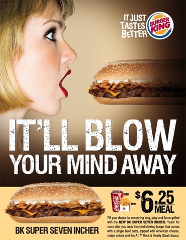
...And I must say, this ad did blow my mind. This burger king advertisement created quite the controversy when released in 2009; the message is loud and clear. We're all adults here, but either way the advertisement is just plain inappropriate. It's intentions were to be funny, and it gained the attention it was meant to, however, I must admit it makes many viewers blush!
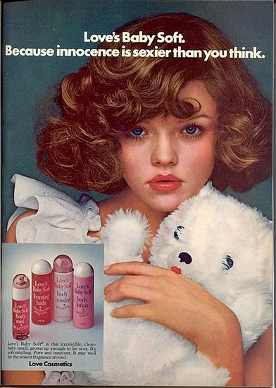
1970s ad

Barely legal is barely sexy, unless you're a pedophile of course. This 1970's Love's Baby Soft ad, screams questionable ethics. The intentions of Love's Baby Soft may not have been to seem inappropriate, however, the whole concept was quite perverted. A young girl holding a teddy bear while simultaneously acting sexy, it just doesn't add up.


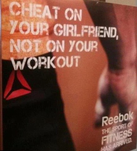
I'll definitely be purchasing my next pair of running shoes from Nike. This Reebok ad was created,  not long ago, in 2009. If the intention was to grab the attention of it's viewer, it did the job. The ad is attention grabbing, shocking, and offending on many levels. I may be slightly biased towards the subject, being that I am a female, however my hope would be that anyone - female or not - would find this ad offensive. "Cheat on your girlfriend, not your workout?" Come on Reebok, you may as well have thrown a giant pig on the poster and gotten the same message across.

Wednesday, April 3, 2013

Week One EOC: My Voice

Fashion is a form of expression that nothing else can compare to. Fashion is art. We see fashion every day, everywhere, on everyone. Fashion expresses our personalities, even our mood; it is creative, artistic, and always changing. In this day and age one of the most important ways of marketing is your image. To be able to be taken seriously has a lot to with how you dress and present yourself. Image is everything, and first impressions are the key to having good business and personal relationships.

 The ever changing fashion industry is something I have discovered to be one of my true loves. With my short attention span, and out of the box ways of looking at life, fashion is the perfect subject for me study. I get a rush from designing, fashion history, putting together outfits, shopping, even just looking at and talking about trends.

From a young age I have had a passion for the beauty industry. There is something about making a person feel beautiful that is so rewarding. Makeup is another true love of mine and I find that makeup and fashion easily go hand and hand. I love learning about the different marketing strategies in order to succeed in my future career -whatever that may be - I know I am on the right track. I cannot wait to find just where it is that I belong in order to use my passions and talents to make a life for myself.

Week One EOC: VW Lemon


How could “Hitler’s favorite car” become popular in America only fifteen years after world war II? How could such an ugly car be popular anyway? Advertising.

The Volkswagen Beetle was creating a buzz everywhere after their unique advertisements in the 1960s. After creating the unique VW beetle, an inspector noticed a flaw in the metal strip along the glove compartment. The blemish needed to be fixed. Volkswagen put out an ad admitting to their mistake but reassuring that it was being fixed. “Honesty: it’s a great angle.” http://www.luon.com/blog/2011/3/2/mad-men-today-how-a-jew-sold-hitlers-favorite-car-to-america.aspx

The advertisement was simple. All it was, was a picture of the VW beetle and the “Lemon.” written underneath. It was simple and minimalistic, but its meaning was not. People everywhere were talking about the and, and to this day it is the best advertisement many have ever seen. “You couldn't help but love a company willing to kid itself in public” http://www.howstuffworks.com/1960-1969-volkswagen-beetle4.htm

The VW Lemon ad was successful for many reasons. Number one, its simplicity, also for its unique style, and especially for its honesty. The straight forward ad earned the trust of consumers everywhere. How could you not trust a company that was willing to tell the truth about its product. “We pluck the lemons; you get the plums.” And Volkswagen did just that.

“From engaging in public service to choosing goods and services, advertising calls people to action.” Advertising by Design